PIMIOLA

Branding
Branding
2022
When developing the brand identity for Pimiola, BLANK PRJCT aimed to capture the essence of the honey bee and its products. They wanted to create a design that was not only visually appealing but also conveyed the connection between the product, its origin, and the consumer. To achieve this, the design team opted for a bright color palette that was inspired by the natural hues of honey and the flowers that bees pollinate. The colors used in the packaging and other branding materials were carefully selected to reflect the brand's identity and values.

The illustrations used in the branding materials were also thoughtfully crafted to create a sense of connection and familiarity with the product. They featured honey bees, honeycombs, and other elements that are associated with the production of honey bee products. These elements were used to create a cohesive and memorable visual language for the brand.

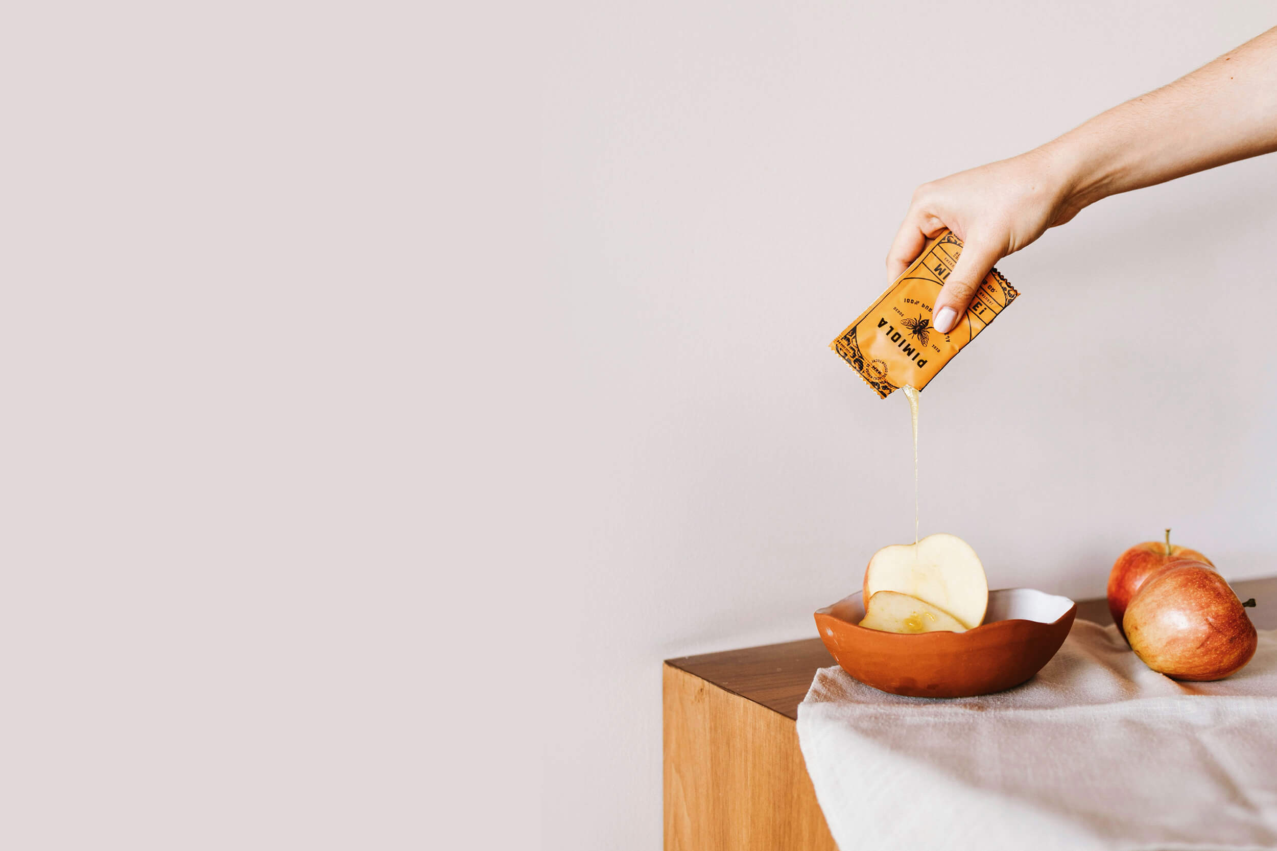
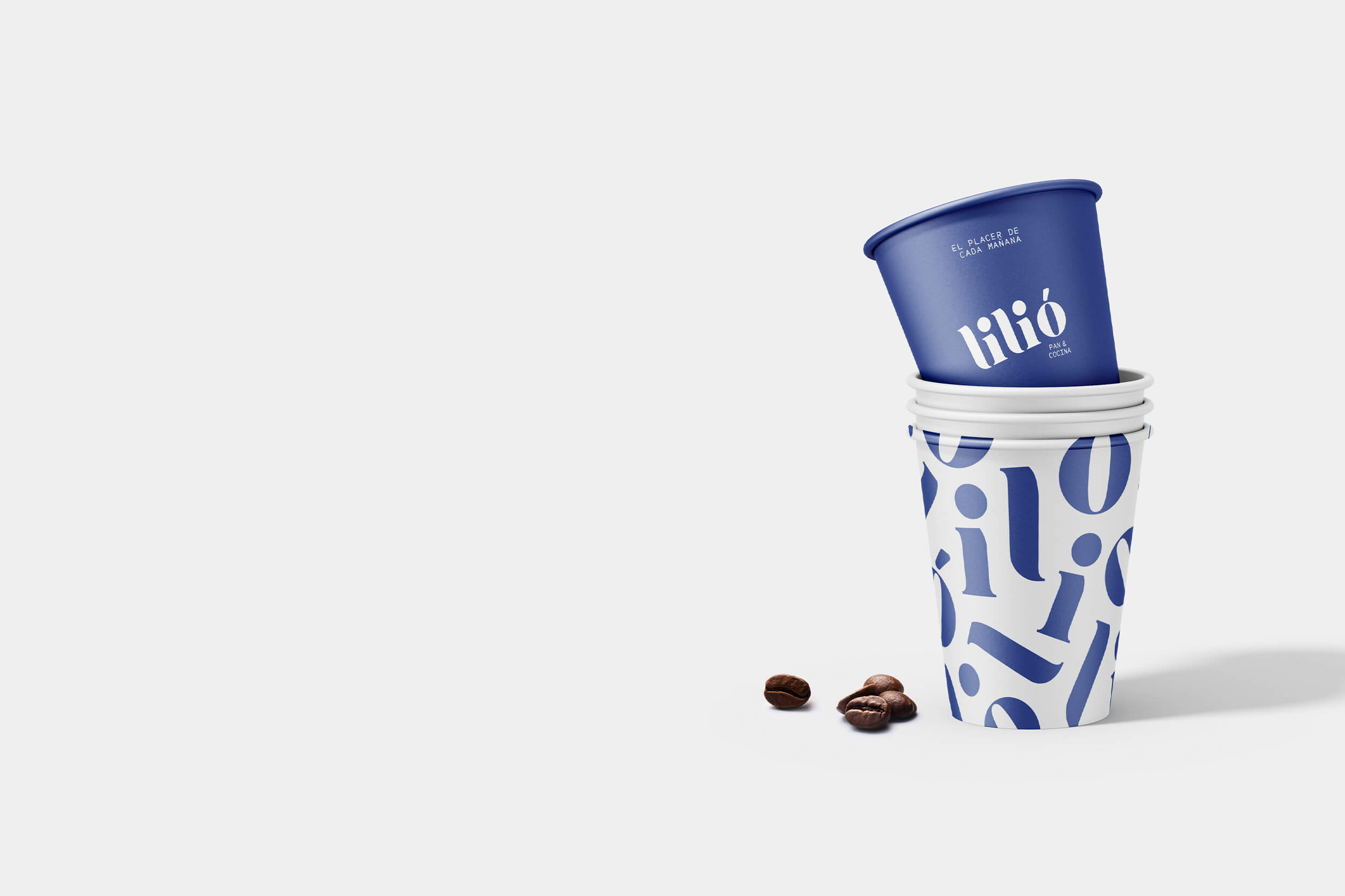
With the expansion of Pimiola's product line, we designed a packaging for a new addition to the Pimiola brand, focusing on the origin of the coffee. The design features a vibrant color palette that has been tailored to each package, staying true to the brand's identity. We took great care in designing this packaging, ensuring that it captures the essence of where the coffee was grown and reflects the quality of the product inside.